Tuesday, November 9, 2010

Logos-the good and the bad


The Playboy Bunny Logo and John Deere are two logos that I like and are well recognized.  The John Deere speaks to its target in color, shape, structure.  It's design represents the brand well.  The playboy bunny is smart in that the bunny is masculine. This logo is now available on Smirnoff liquor bottles and people want to buy the bottles simply to have the vodka bottle with the bunny logo.


I dont like this Zoo Logo.  The picture of the Polar Bear is too distracting. Im also not a fan of our National Aquarium Logo. I feel like they could have been more creative. The strikes throughout the lettering I find to be confusing..are they trying to replicate water marks? 

Friday, October 29, 2010

photoshop tutorials

i found this site..that shows you how to do a lot of really creative things using photoshop--take your pick as to which effect you would like and use the video to learn how to use photoshop to get your desired look.

http://designrfix.com/resources/photoshop-tutorials-60-hot-tutorials

Thursday, October 28, 2010

mailing


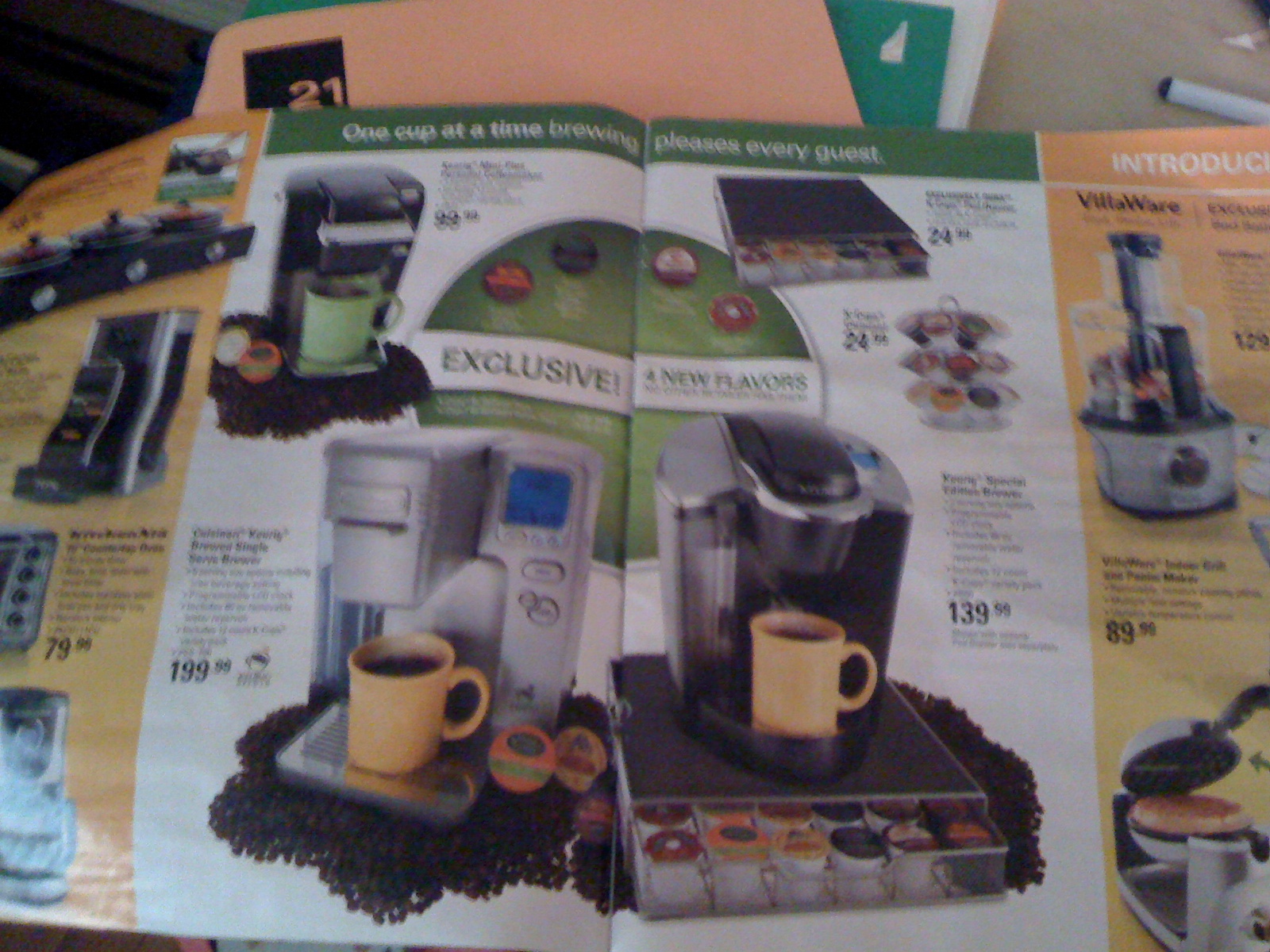
Bed Bath and Beyond Catalog that everyone has seen, I'm sure.  The catalog is thin and flimsy, and holds lots of information and pictures.  It folds in half simply to fit in mail boxes and is durable to withstand outdoor weather such as rain. The pages are set up basically as if you are reading a magazine and don't consider the fold that happens in the mailing process. 

Tuesday, October 19, 2010

Grids

This was found in Conde Naste, Traveler.  The grids make the article clear and to the point.  Depending on which category you are interested in reading about immediately draws you in to that grid area for more information.

Friday, October 8, 2010

Magazine Layout


I found this in Conde Naste Traveler.  I like the creative spin on the bubbles around the pictures giving you a timeline of things to do over the course of the weekend.  The circles draw your attention and make you interested to know your options for every hour of the day over the course of a weekend when traveling and in addition draw you to follow the circles around the provided images.

Thursday, October 7, 2010

Indesign-how its helped

Indesign has been extremely beneficial for me.  It allows me to be more creative with different ideas that I may have that would otherwise not be able to be done in other programs.  It has also allowed me to think differently in terms of placing words and changing letter size and fonts and colors. Using indesign challenges me to think differently in terms of placing items and creating various pieces.

Wednesday, October 6, 2010

Typography


Both of these companies are similar in that they both use a blue background and white letters.  They appear similar at first glance, but are very different as well. Facebook uses a blue rectangle and its letters are more thick and less type-like. The letters are bold and stand out and have the trademark for the name as well.  Old Navy uses all caps in its lettering implying importance and its shape is oval.  Its interesting how both companies who are very different have chosen very similar concepts for their brand name to be recognized.